Did Typesetter "Convenience" Establish Our Decimal Notation System?
by Fritz Swanson
|
In A History of Mathematical Notation by Florian Cajori (1928) it says, "The Invention of decimal fractions is usually ascribed to the Belgian Simon Stevin, in his La Disme, published in 1585." Cajori goes on to note that Stevin's original notation was idiosyncratic relative to modern notation. Stevin marked the decimal numbers with a sequence of superscript numbers in circles. For example, 31.869 would have been rendered by Stevin as 31⓪8①6②9③. When Stevin's work was translated into English in 1608, it was already simplified by replacing the custom circled superscripts with superscripts in parenthesis, as in: 31(0)8(1)6(2)9(3). Further variations of this superscript system use different hashmarks in place of the superscript numerals (explored below). The question put to me is: "Was Stevin's system abandoned in favor of the decimal system in order to accomodate typesetters?" Which is to say, was this original system too "difficult" for typesetters to set? Did the old system die for the "convenience" of typesetters?
|
|
 |
First, it is worth pausing to consider what a "typesetter" is. To the left is a handset forme of type built up on a galley. You can see that every letter, every space, and every punctuation mark is an individual piece of metal type. This type is cast in an alloy of lead, antimony and tin, and it is handled by a worker called a "compositor" or "typesetter". Typesetting is a slow and considered trade, requiring skill and patience on the part of the worker. It is also one of the few manual trades that requires the worker to also know something of the literary and/or philosophical world. If a typesetter is to set a latin text, for example, it is often helpful (though not required) that the worker be able to read latin. (There were two typesetters who worked on Shakespeare's first folio, for example, and we can tell their work apart because one knew latin and the other did not.) Similarly, it seems highly likely that a typesetter who works on mathematical and scientific treatises would know something about the ideas conveyed. It is also worth noting that typographical symbols were very much up for grabs in the early modern period. As MB Parkes describes in his history of punctuation Pause and Effect, there was much confusion about how, and with what symbols, to punctuate European prose (let alone math). The Romans didn't have a widely used punctuation system (or spaces between words for that matter) because they were still largely an oral society. As medieval scholars worked to preserve the latin classics, they began to use different symbols as well as different kinds of negative space to make what was becoming a foreign language sensible to contemporary readers. By the high middle ages, some scholars were using what we would recognize as "punctuation" by literally using variations of "points" (or "punctus"). But other scribes were using a competing system, the "solidus" system, composed of a variety of forward slashes. These were the Betamax and VHS standard wars of the middle ages. This background informs my opinion of what I am seeing in the examples below. After studying Cajori's narrative of the evolution of the decimal point, I drew upon a supplementary source called Writing the History of Mathematical Notation by Sister Mary Leontius Schulte. Sister Schulte was able to identify some specific texts in the University of Michigan Special Collections library which presented examples of the early Stevin decimal notation system. Using her work as a Guide, I went and examined several books from the 16th and 17th century.
|
| Here is the clearest example I could find of this notation system. It comes from the Geometria Subterranea... by Nicolaus Voigtel (1686). In this example you can see the Stevin's system executed with a small o above the units place, and then the corresponding hashmarks made over the requisite decimal positions. You can also see in the prose above the numbers that the solidus system is used in place of comma punctuation. The hashmarks are, obviously, soliduses (forward slashes) of the typesize one step down from that used for the rest of the text. Though type sizes weren't standard at this period, I would guess the body type is about 18pt, and the hashmarks are 14pt. Given that this printer is already using the solidus system for "punctuation", it makes sense that he would use forward slashes as a hashmark system in place of numerals. They are plentiful in his shop, and easy to set. It's also worth noting that his numerals are Italian while his text typeface is a more characterist German blackletter. Because he is using old-style italian numerals, there is no even baseline (which you can see when you examine the 6). This might have also informed the decision to use soliduses for hashmarks. The so-called "lining figures" with a uniform baseline for all numbers wouldn't become standard until the 19th century. If he had used superscript numerals above his main numerals, the uneven baseline would have been very confusing. |
 |
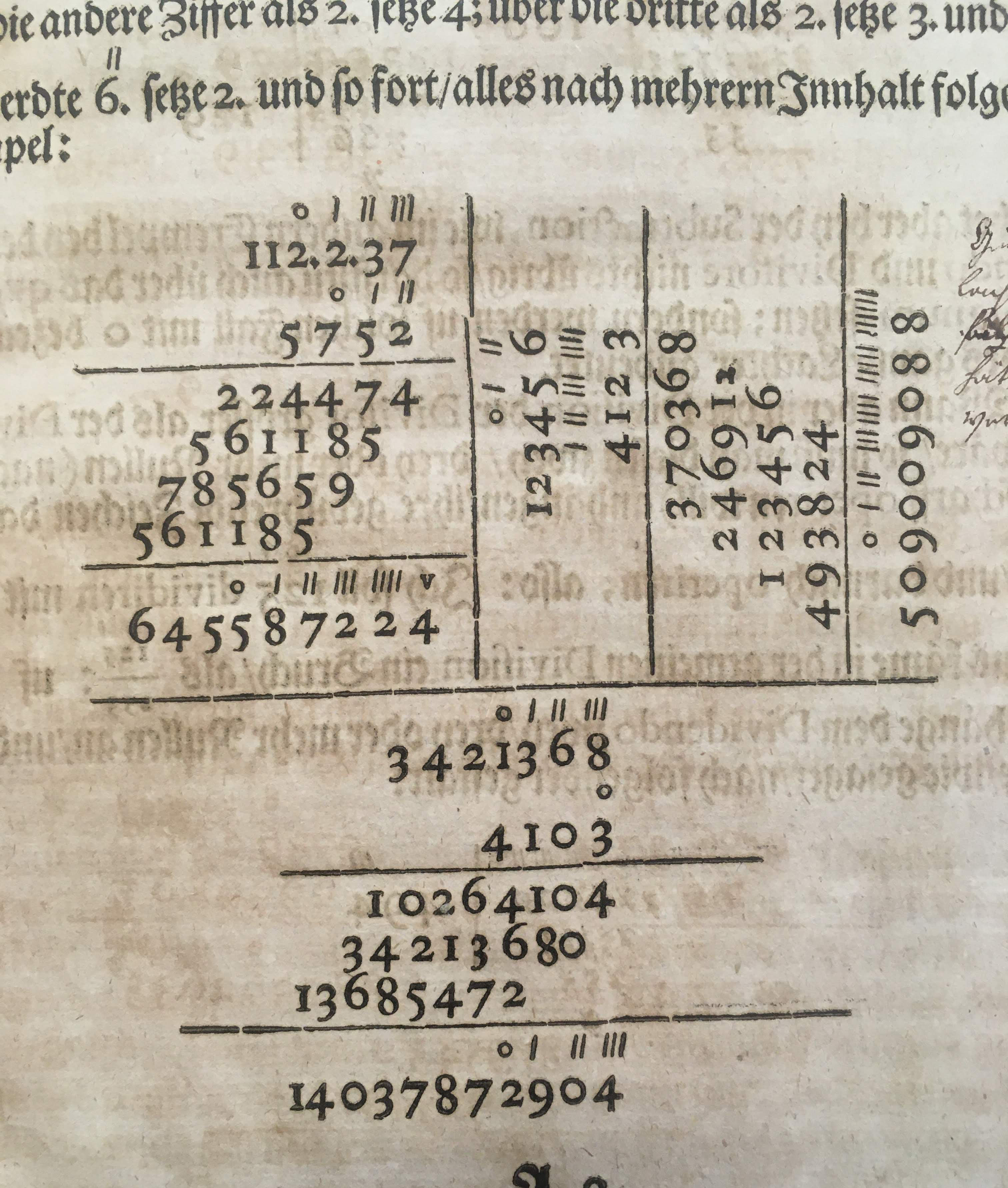 |
Based on the use of hashmarks, you might make a case for typesetting convenience in Geometria, but then you look at a page like this, and as a typesetter I would observe the following: It is true that setting extra horizontal lines of type is extra work. And it is true that manually aligning those hashmarks with the numbers "below" would be challenging. (One should note that when setting type, you are building the forme upside down. So the setter would need to set the hashmarks first, THEN set the numeral line second "ABOVE" the hashmark line relative to the typesetter. So, there would either need to be planning ahead of the line, or adjustments made after both lines are set.) But setting lines perpendicular to one another is MORE challenging than extra lines would ever be. An extra line is just an extra line; it is neither physically, nor conceptually, a radical departure from standard straight setting. It's just MORE straight setting, with a little adjustment added in. But setting numbers sideways, and setting RULED LINES sideways, is more challenging. Notice, especially, that the top left vertical line is broken at the base of the second row of hashmarks. That might indicate that extra space was needed to make the hashmark line align with the numerals below, thus throwing off the first vertical ruled line. It might not, but it does indicate that the ruled line work was sufficiently challenging as to prevent the typesetter from accomplishing his task correctly. My key point here is that typesetting is hard. And mathematical typesetting seems really hard. But all things considered, the hashmark notations don't seem especially challenging relative to all the work going into one of these pages, so it would seem specious to me to single that one feature out. The Stevin's decimal notation system doesn't stand out compared to everything else. |
| I think this page is more instructive. Notice that we have both an inset column of numerals with decimal notation, as well as decimal numerals with hashmark notation set inline with the prose. And notice that the inline numerals require an extra white line to accomodate the hashmark notation system. So, in the prose of this book, when there are no decimal numerals in a paragraph, there are no unsightly breaks in the prose. But when there IS a decimal numeral, the superscript system adopted by this printer REQUIRES an unsightly white space to break up the uniform block of text. Uniform text blocks are an almost universal characteristic of prose set in the early modern period. Tightly set, square justified, heavy black text was the overwhelming norm for prose typesetting in this period. When modern typographers look back at this period, it is the dense black columns of text that inspire our design. To see a typesetter of that period be forced, by an arbitrary and novel system, to break up that uniform field of text... well it makes one sad. Given this observation, I would say that the Stevin's superscript system for decimal notation was not a PHYSICAL burden on a typesetter, but instead it was an AESTHETIC burden for everyone involved. |
 |
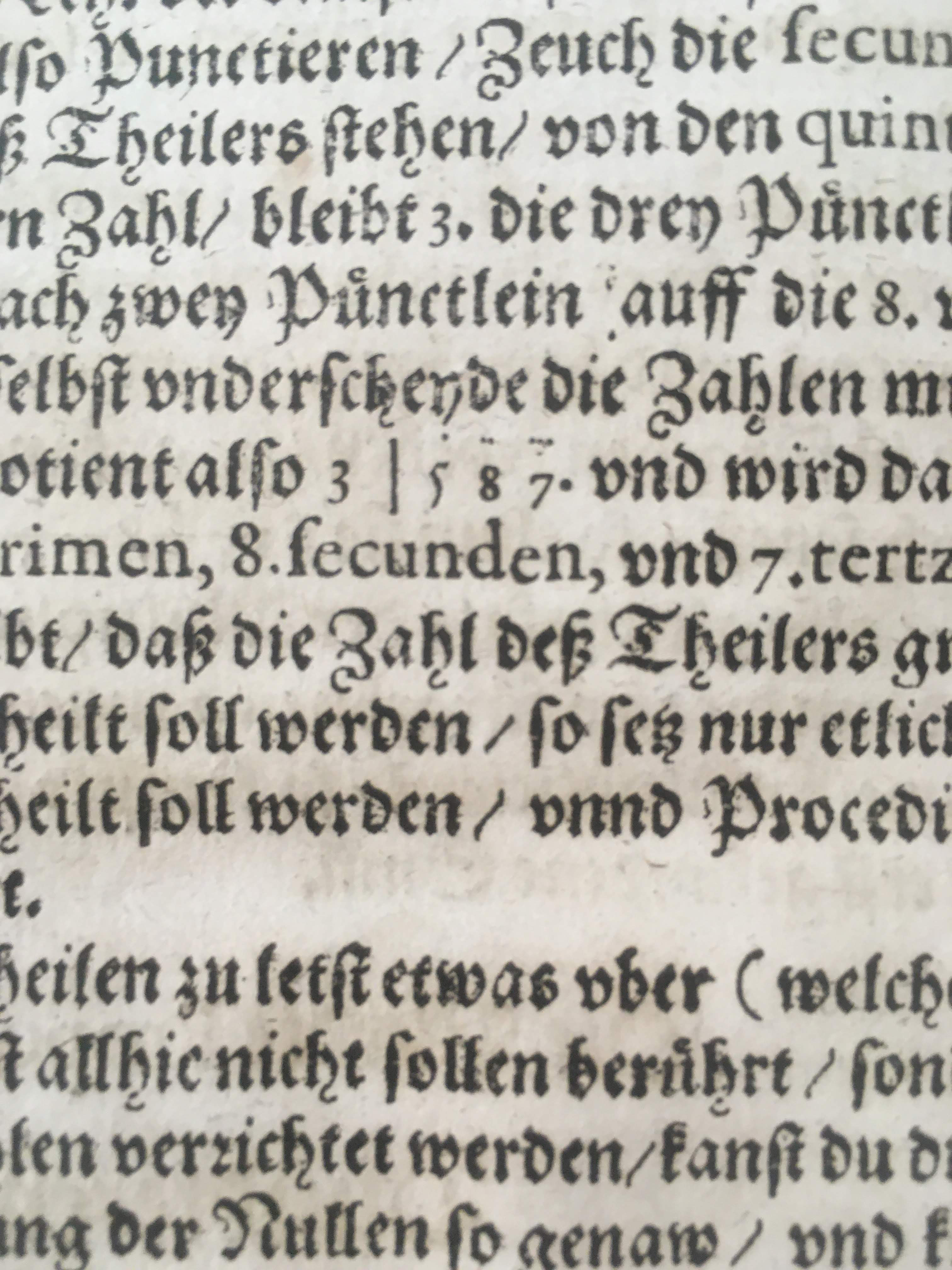 |
To supplement this point, let me jump back to 1618 and show you an example from Johan Rudolff von Graffenried's Arithmeticae Logistica Here, you can see a variant hashmark system in use, where the hashmarks are very small. The vertical line in place of the decimal point helps to render some sense, and then the hashmarks are barely pricks on the page. I am not even sure how these would have been set. They don't appear to break the line, so they can't have been set on their own line. Even a single period, like you see after the final 7 in the numeral, would have been on a full size type body the same height as all the other letters in the line. Also, notice how robust the period is here, matching the heavy blackletter typography of the page. My best guess is that the printer has used some pins cut down to exactly type height that can easily be fit in amongst the type without creating any unsightly white space. But that is, at best, an informed guess. In any event, the hashmarks don't print very clearly, and the vertical line does most of the work. |
| But what really seals it for me is that, in the same copy of Arithmeticae the reader finds all of these beautiful and elaborate tipped in prints to unfold. Each of these prints was a typesetting marvel, building out remarkable forms of both visual beauty and mathematical logic. This confirms to me that LABOR was not the chief concern of the typesetter. BEAUTY and SENSE seemed to play a far larger role in his decisions.
And that seems to answer this question for me. The decimal point system, like the point based punctuation system in European prose, wins out for being simple, elegant, and unobtrusive. |
 |
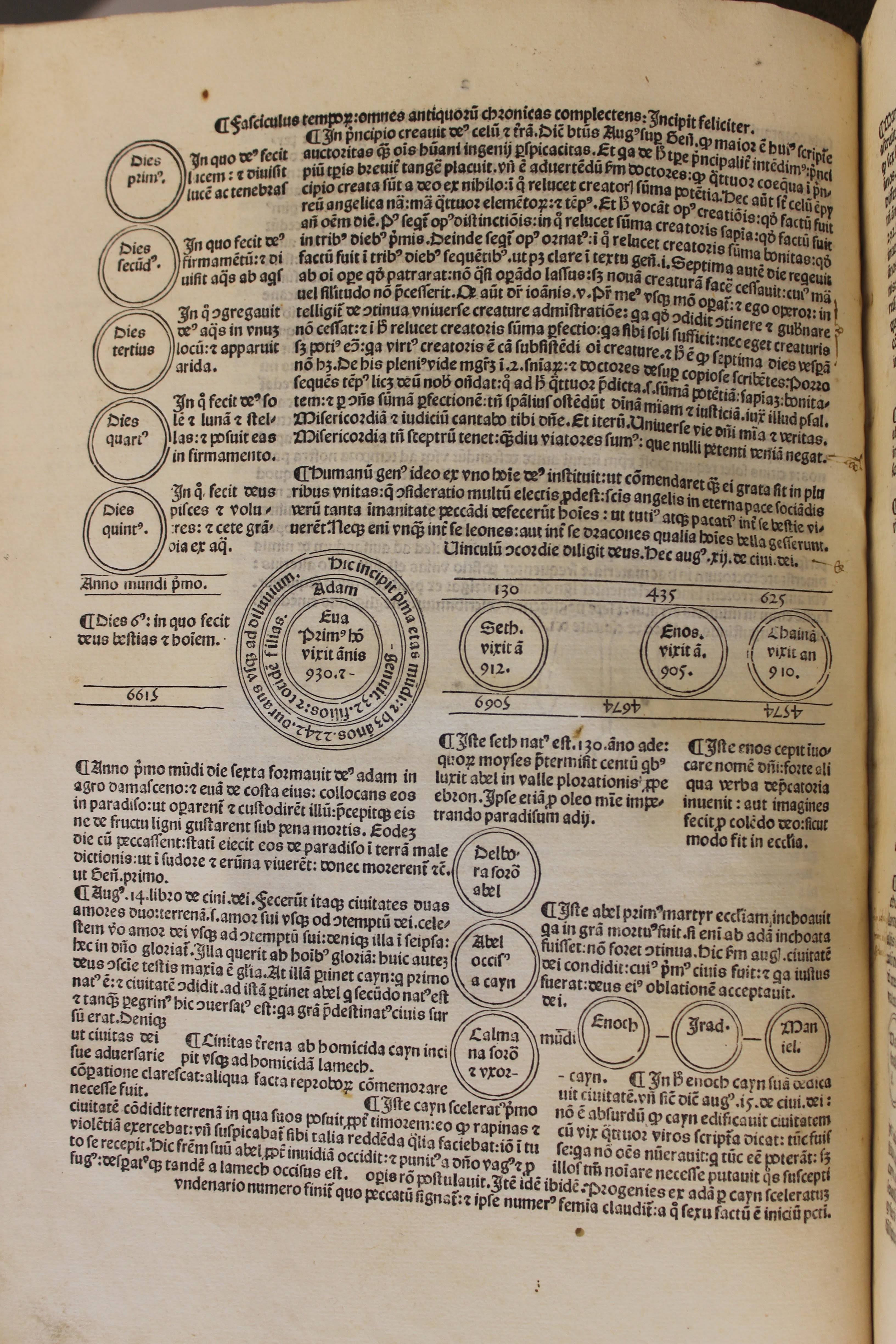 |
As an addendum, consider this page from Fasciculus Temporum, printed by Erhard Ratdolt in 1484. This is not a mathematical text, but you can see the complexity of the typesetting work, with the circular rules, and the typeset directly in between the lines of the circles. Typesetters could do complex and painstaking work. But I think they would only do it when it was beautiful, and if they believed it was informative. The work that goes into typesetting is long, but the idea is that once that work is done, the page will outlast the sweat of that labor. Each of these pages inspected may have taken hours or even days to set. But the pages themselves have lasted for centuries. Typesetters understood that, and valued their time and effort against that scale.
|